 Zion Builder
Alert
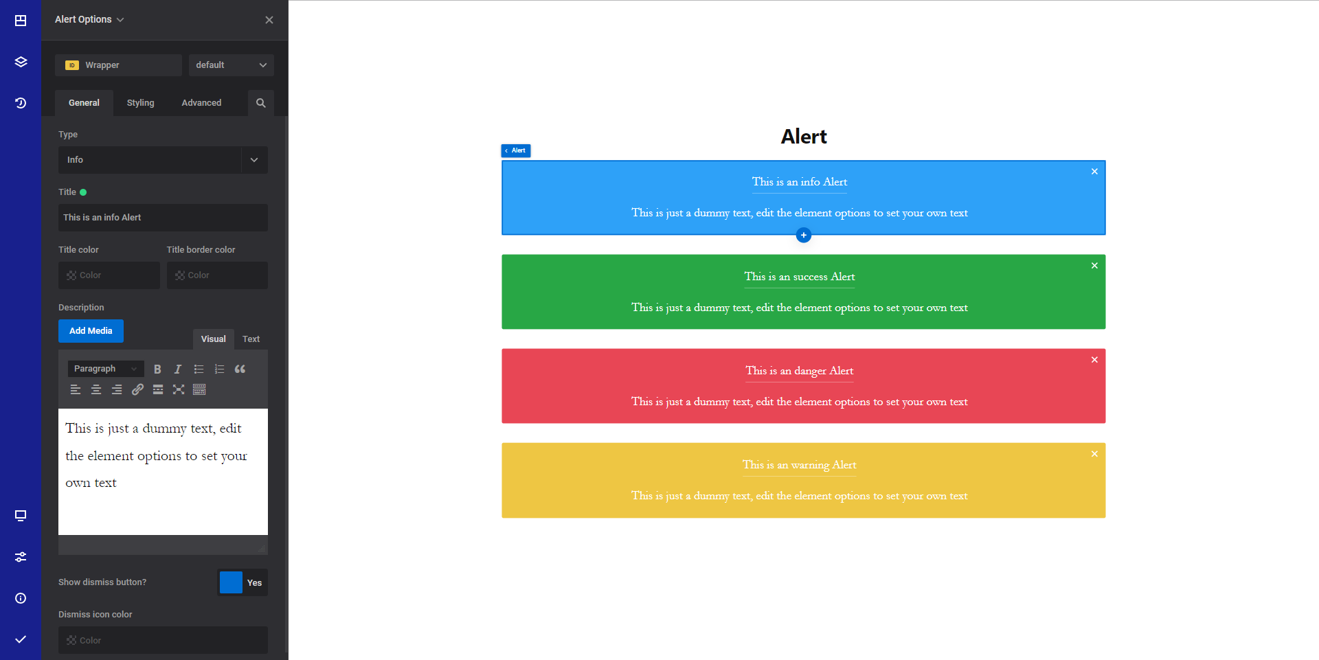
General info
The alert element allows you to display important messages using colored boxes. This is a great way to draw attention to your content.
These alert boxes can also be dismissed if you enable the dismiss button ( enabled by default ).
General options
- Type - Select the alert type between: "info", "success", "danger" or "warning"
- Title - Set the desired alert title. If you leave this field empty, the title will not appear
- Title color - Set the desired title color.
- Title border color - Set the desired title border color. By default, a border appears under the title. This can be removed by setting the title border to a transparent color.
- Description - Set the alert content.
- Show dismiss button - Show the dismiss button. Please note that if you hide the dismiss button, there is no way for user to dismiss the alert.
- Dismiss icon color - Set the desired color for the dismiss button.
Style options
TIP
Zion Builder elements allows you to style almost every part of an element. All style options follow the same options structure. You can find more info about style options here
- Wrapper - Will style the wrapper of the element.
Advanced options
TIP
All the options inside the advanced options tab are the same for all elements. You can find more info about advanced options here