 Zion Builder
Column
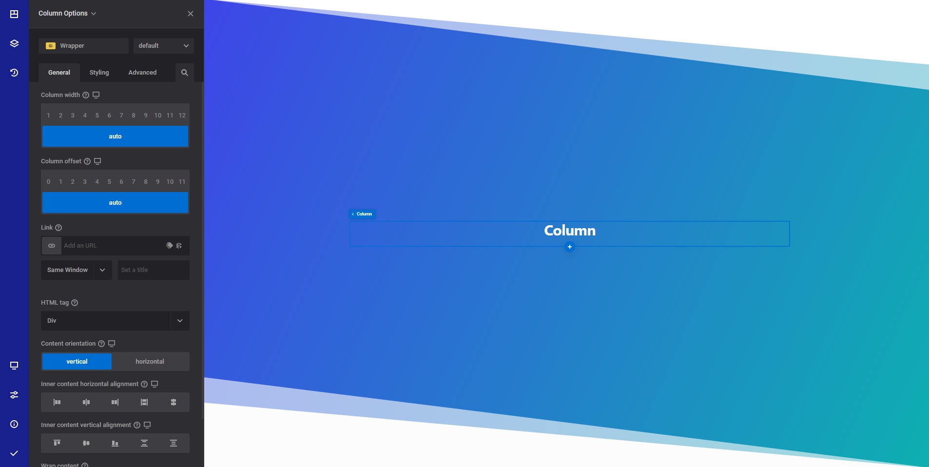
General info
The column element allows you to easily wrap your content in predefined box width. Unlike the container element, the column comes with predefined styles to easily create your layouts by providing predefined column widths.
Column general options
- Column width responsive options - Select the desired with from a selection between 1 and 12. The number represents the available space for the column divided by the selected width. If auto is selected, the column will be displayed full width or, in case the parent container have specific flex options will display based on those options.
- Column offset responsive options - Select the desired column offset.
- Link - Wrap your entire column content inside a link.
- HTML tag - Select the desired HTML tag to use for the section wrapper element. Read more about HTML tags
- Content orientation responsive options - Allows you to show the content vertically or horizontally
- Inner content horizontal alignment responsive options - Select how the inner content is horizontally displayed on the page
- Inner content vertical alignment responsive options - Select how the inner content is vertically displayed on the page
- Wrap content - If you choose to wrap the content, all inner elements will be placed on a new line if there is no space for them on the same line.
- Shape dividers - Allows you to add a top or bottom shape to your element. Read more about shape dividers
WARNING
If you set a link to your column, your content cannot contain another link (<a> tag). By nesting links the page may become broken.
Style options
TIP
Zion Builder elements allows you to style almost every part of an element. All style options follow the same options structure. You can find more info about style options here
- Wrapper - Will style the wrapper of the element.
Advanced options
TIP
All the options inside the advanced options tab are the same for all elements. You can find more info about advanced options here