Responsive breakpoints

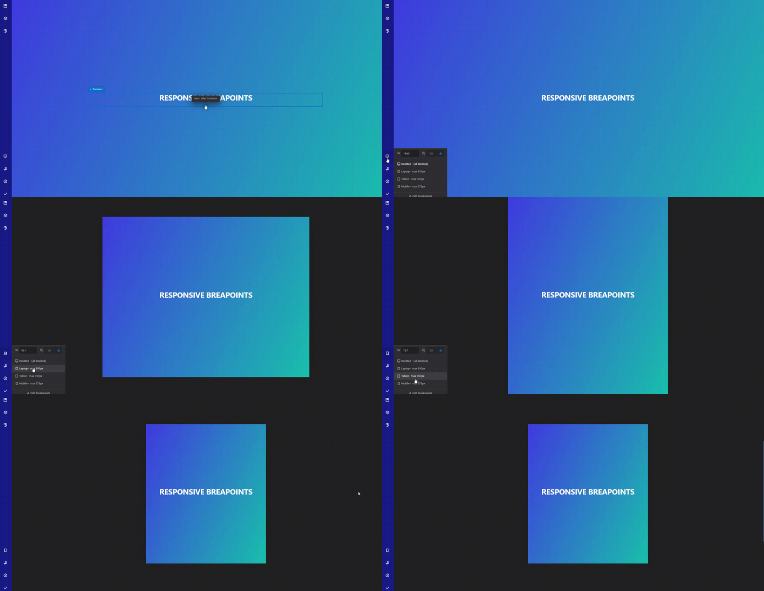
With Zion Builder you can style your page based on the device width. This is a great way to create pixel perfect websites that look good on any device.
TIP
With Zion Builder PRO you can create additional responsive breakpoints.
General info
While editing the page with Zion Builder, you can change the active responsive breakpoint from the device icon from the main bar. While hovering this icon, a list of available responsive breakpoints will appear allowing you to set the active breakpoint device or edit the breakpoint list by adding or modifying the existing breakpoints.
This popup also allows you to change the preview window width and scale to better suit your desired workflow.
When selecting a responsive device, some options will be applied only for the selected device. All the options from the Style tab from the element options will take in consideration the active responsive device. Additionally, some options that apply their value based on the active responsive device will show a responsive devices next to the option title.
Editing breakpoints PRO
TIP
Breakpoints are saved globally on your website. When you change the breakpoint width value, the css cache is automatically regenerated to reflect the change
- Hover over the breakpoint icon from the main bar
- Press the edit breakpoints button
- Press the pencil icon that appears on the right of your existing breakpoints
- Set the new breakpoint width value
- Save the change by pressing enter key on the keyboard or press the checkmark icon
Adding new breakpoint PRO
- Hover over the breakpoint icon from the main bar
- Press the edit breakpoints button
- Press the Add breakpoint button that appears at the bottom
- Set the breakpoint width value
- Save the change by pressing enter key on the keyboard or press the checkmark icon
Deleting custom breakpoints PRO
WARNING
Breakpoints are saved globally. If you delete a custom breakpoint that is used in a different page, it will stop working after deleting it.
- Hover over the breakpoint icon from the main bar
- Press the edit breakpoints button
- Press the trash can icon that appears on the right side of your custom breakpoints
Change preview width
Zion Builder allows you to change the preview width so you can check how your website would look like in a different device width.
In order to change the device width, you will have to:
- Hover over the breakpoint icon from the main bar
- Change the preview width from the preview width field

TIP
The preview width is not saved to the database. It will revert back to the default width of the selected device when you refresh the page or change the active responsive device
Change the preview window scaling
This allows you to show a horizontal scrollbar inside the preview window or scale the preview window content to match the browser/active device width.
How to chang the preview window scale:
- Hover over the breakpoint icon from the main bar
- If the scale is locked ( blue lock ) the scale factor is disabled and the preview window will be automatically calculated based on the available space for the preview window. If the scale is not locked, you have the ability to select your desired preview window scale factor.
 Zion Builder