 Zion Builder
Tabs
General info
The tabs element is a graphical user interface component commonly used in web pages and applications to organize and display content in a structured way. It consists of a set of horizontally arranged tabs, each representing a different category or section of content. When a user clicks on a tab, the associated content is displayed while the content from other tabs is hidden. Tabs are often used to conserve screen space and improve the usability of an interface by providing a clear and intuitive way to navigate between related sections of content.
Using PRO you are not limited by just text as the tab content and you can add any other Zion Builder element.
TIP
When activating Zion Builder PRO, all tabs text content will be converted automatically into text elements that can be individually configured.
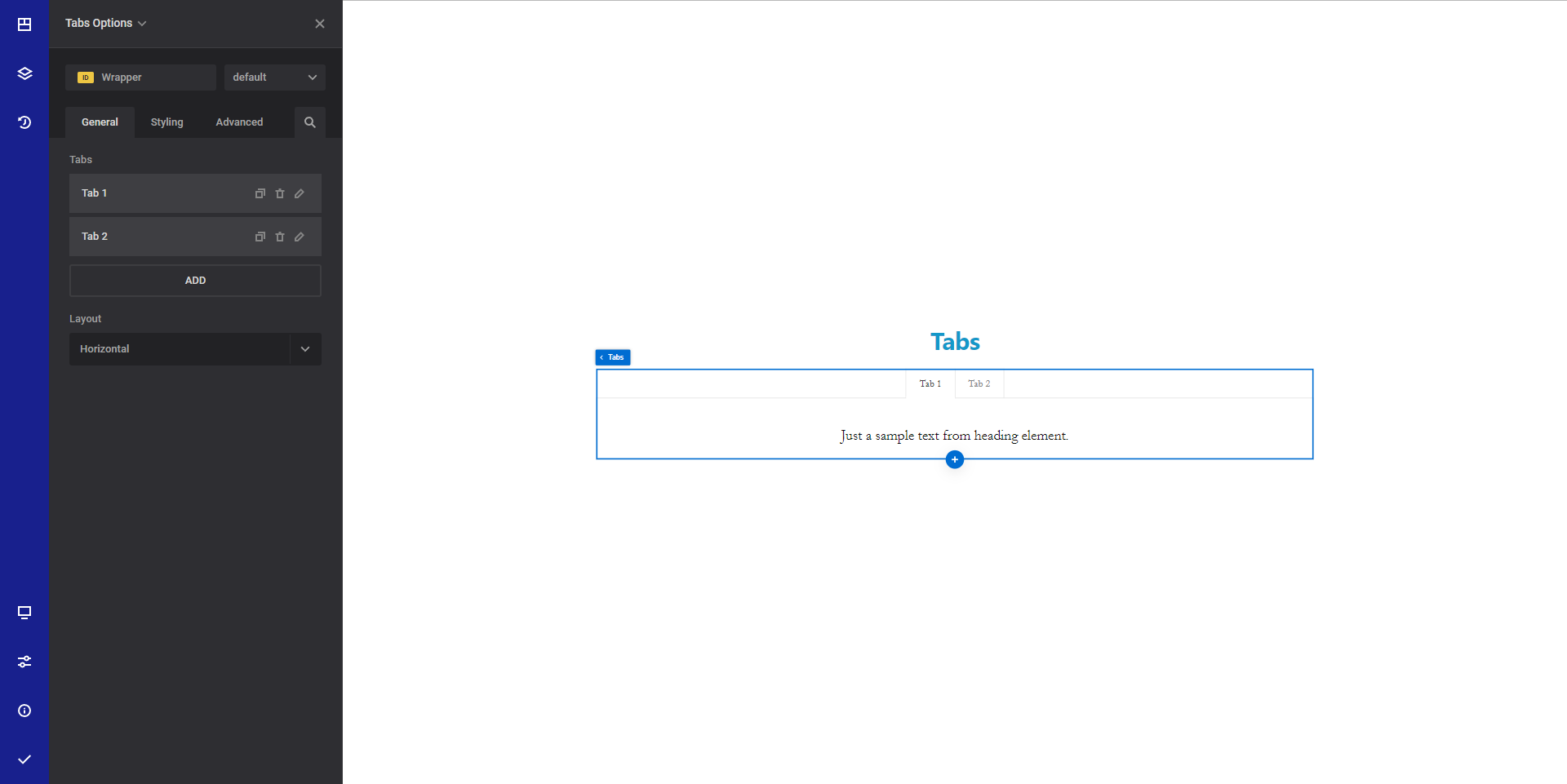
General options ( Tabs container )
- Tabs - Using this option you can add/remove/edit your tabs
- Layout - Select the layout of the tabs. You can choose between "Horizontal" and "Vertical" layout
General options ( Tabs item )
- Title - Set the title of the tab item
- Content - Set the tab content. Please note that this option is hidden when using PRO as the content is generated using other page builder elements
Style options ( Tabs container )
TIP
Zion Builder elements allows you to style almost every part of an element. All style options follow the same options structure. You can find more info about style options here
- Wrapper - Will style the wrapper of the element.
- Tab titles styles - Will style all the tab titles inside the tabs element.
- Active tab titles styles - Will style the active tab title.
- Content styles - Will style the content of the tabs.
Style options ( Tab item )
- Wrapper - Will style the wrapper of the element.
Advanced options
TIP
All the options inside the advanced options tab are the same for all elements. You can find more info about advanced options here