 Zion Builder
Icon
General info
The icon element allows you to add icons to your pages. With Zion Builder style options you can spice up your page by styling and animating the icons.
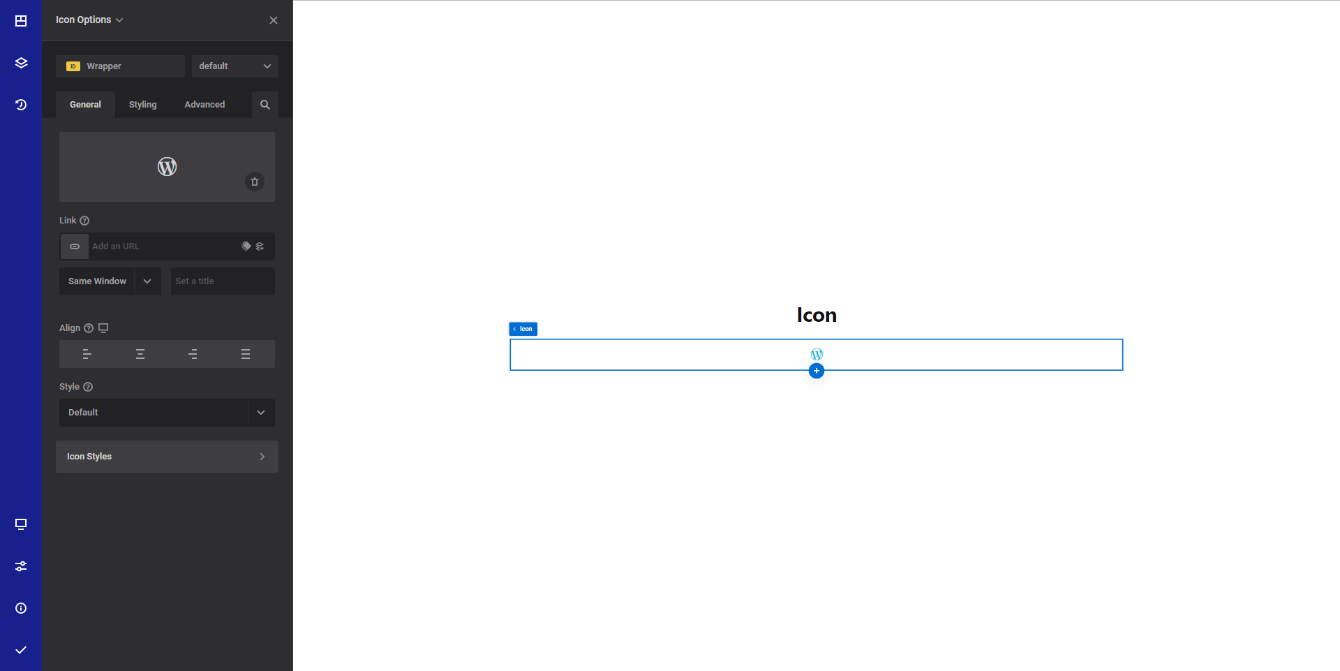
General options
- Icon - Select the desired icon you want to display. Read more about icons here
- Link - Set the link that will be applied to the icon.
- Align responsive option - Set the desired icon horizontal alignment inside the container.
- Style - Set the desired icon horizontal alignment inside the container.

- Icon styles - Collection of useful style options for the icon:
- Pseudo selector - Select what type of style you want to apply. You can choose between normal or hover styles
- Icon color - Select the desired icon color
- Icon size responsive option - Select the desired icon size
- Space around icon responsive option - Select the desired space to apply around the icon
- Icon rotate - This option allows you to rotate the icon
Style options
TIP
Zion Builder elements allows you to style almost every part of an element. All style options follow the same options structure. You can find more info about style options here
- Wrapper - Will style the wrapper of the element.
- Icon styles - Will style the actual icon
Advanced options
TIP
All the options inside the advanced options tab are the same for all elements. You can find more info about advanced options here