 Zion Builder
Button
General info
The button element allows you to add buttons to your pages.
General options
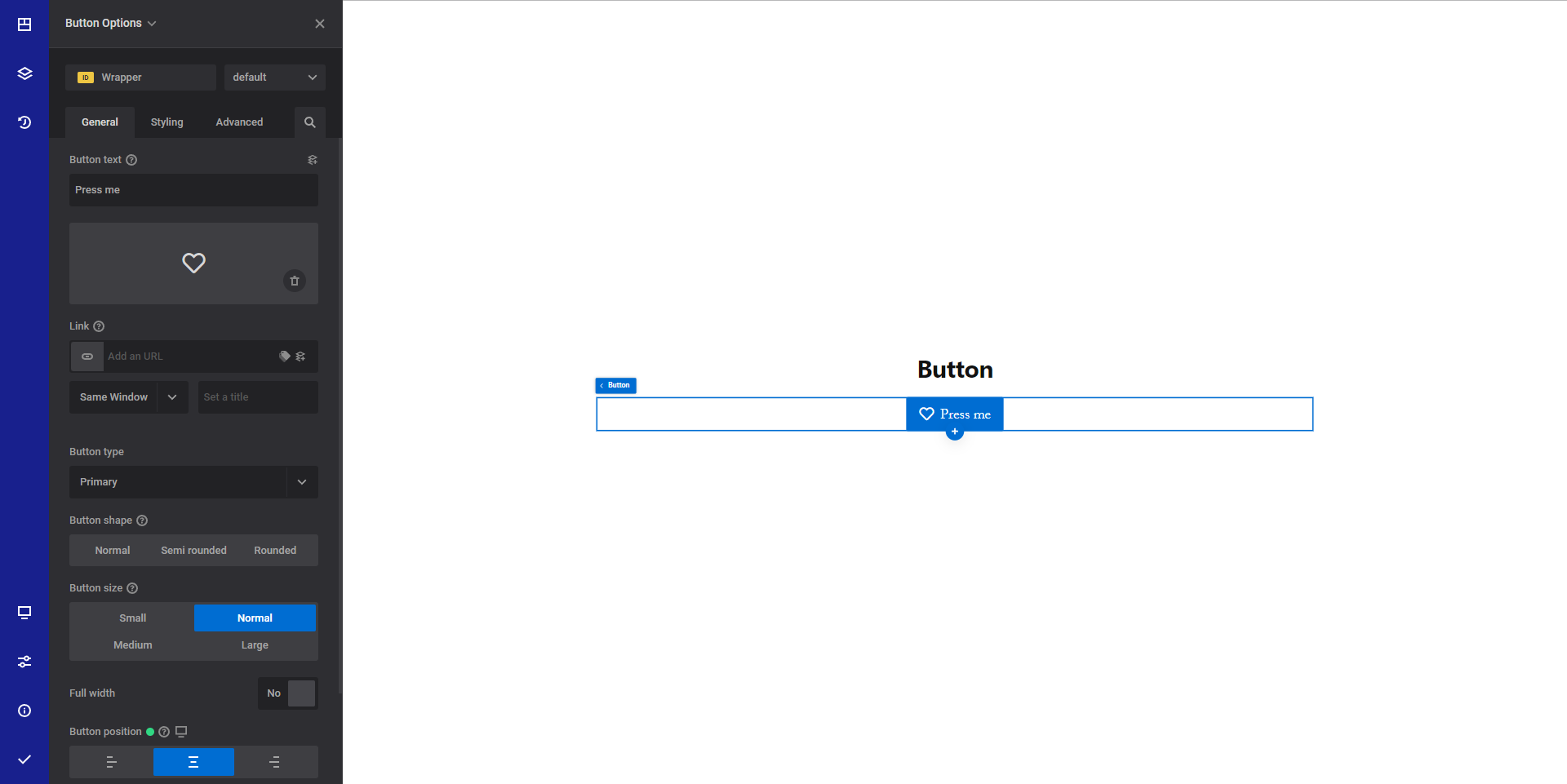
- Button text dynamic content - Set the desired button text
- Icon - Select an icon that will appear beside the text
- Link dynamic content - Set the desired URL that the button will point to. Read more about the link option here
- Button type - Select from a list of predefined button styles. You can have full control over the button styling by accessing the Style tab.
- Button shape - Select the desired button shape.
- Button size - Select the desired button size from a predefined list of button sizes.
- Full width - Choose yes if you want your button to have 100% width based on the available space.
- Button position responsive option - Select the desired button position. This option will only be visible if you set "Full size" option to "no".
- Icon position - Select the desired icon position. You can show the icon in all 4 sides of the button text.
Style options
TIP
Zion Builder elements allows you to style almost every part of an element. All style options follow the same options structure. You can find more info about style options here
- Wrapper - Will style the wrapper of the element.
- Button styles - Allows you to style the actual button
- Icon styles - Allows you to style the icon
Advanced options
TIP
All the options inside the advanced options tab are the same for all elements. You can find more info about advanced options here