 Zion Builder
Container
General info
The container element allows you to group your elements inside containers. This is useful for advanced users who want more control over their layout.
General Options
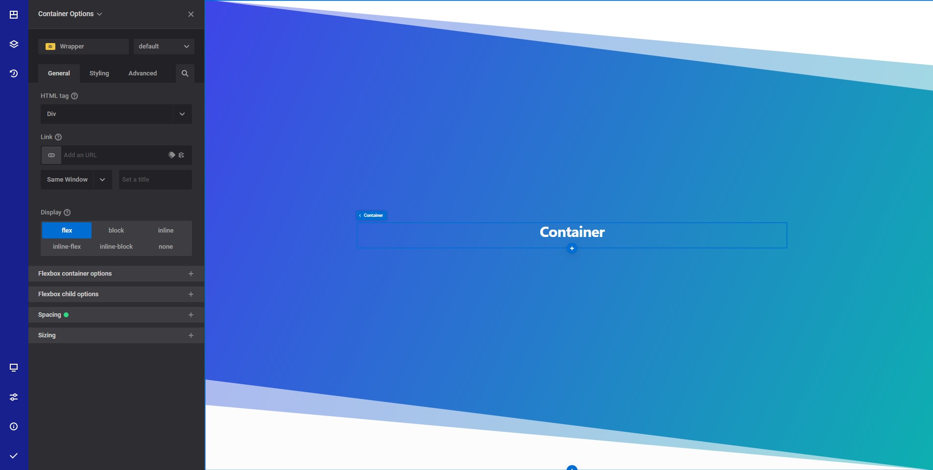
- HTML tag - Select the desired HTML tag to use for the section wrapper element. Read more about HTML tags
- Link - Wrap your entire column content inside a link.
- Display - Select the CSS display property you want to use
Flexbox container options responsive options
These options influence how the element displays.
- Gap - The gap option allows you to specify the gap between child elements on the main axis. Current browser support is 89.92%. In order to increase browser support, you can use margins
- Flex direction - The flex-direction CSS property sets how flex items are placed in the flex container defining the main axis and the direction (normal or reversed).
- Align items - The CSS align-items property sets the align-self value on all direct children as a group. In Flexbox, it controls the alignment of items on the Cross Axis. In Grid Layout, it controls the alignment of items on the Block Axis within their grid area.
- Justify - The CSS justify-content property defines how the browser distributes space between and around content items along the main-axis of a flex container, and the inline axis of a grid container.
- Wrap - If you choose to wrap the content, all inner elements will be placed on a new line if there is no space for them on the same line.
- Align content - The CSS align-content property sets the distribution of space between and around content items along a flexbox's cross-axis or a grid's block axis.
Flexbox child options responsive options
- Flex grow - The flex-grow CSS property sets the flex grow factor of a flex item's main size
- Flex shrink - The flex-shrink CSS property sets the flex shrink factor of a flex item. If the size of all flex items is larger than the flex container, items shrink to fit according to flex-shrink.
- Flex basis - The flex-basis CSS property sets the initial main size of a flex item. It sets the size of the content box unless otherwise set with box-sizing
- Align self - The align-self CSS property overrides a grid or flex item's align-items value. In Grid, it aligns the item inside the grid area. In Flexbox, it aligns the item on the cross axis.
- Order - Select if you want your element to be displayed first or last inside the parent container. Please not that in order for this to work, the parent container must be displayed as flex.
- Custom order - Input the desired element order in relation to his siblings.
Spacing responsive options
- Margin & padding - Set the element margins and paddings.
Sizing responsive options
- Width - Set the element desired width.
- Min width - Set the element desired minimum width.
- Max width - Set the element desired maximum width.
- Height - Set the element desired height.
- Min Height - Set the element desired minimum height.
- Max Height - Set the element desired maximum height.
Style options
TIP
Zion Builder elements allows you to style almost every part of an element. All style options follow the same options structure. You can find more info about style options here
- Wrapper - Will style the wrapper of the element.
Advanced options
TIP
All the options inside the advanced options tab are the same for all elements. You can find more info about advanced options here