 Zion Builder
Progress bars
General info
An animated progress bar element provides visual feedback to indicate the progress of a task or process.
General options
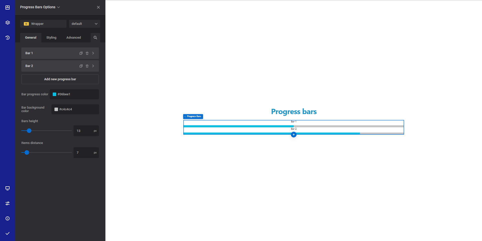
- Bars - Using this option you can add/delete/edit your progress bars
- Title - Set the desired title for the progress bar
- Fill percentage - Set the desired progress in percentage for the bar
- Bar progress color - Set the desired progress color for the current edited progress bar
- Select the desired bar style - Choose from a list of predefined styles that will be applied to the edited progress bar.
- Bar progress color - Select the desired bar progress color. This is the color that shows the progress.
- Bar background color - Set the desired bar background color.
- Bar height - Set the desired bars height.
- Items distance - Set the desired distance between progress bar items
Style options
TIP
Zion Builder elements allows you to style almost every part of an element. All style options follow the same options structure. You can find more info about style options here
- Wrapper - Will style the wrapper of the element.
- Title styles - Will apply styles to single bar title
Advanced options
TIP
All the options inside the advanced options tab are the same for all elements. You can find more info about advanced options here