 Zion Builder
Separator
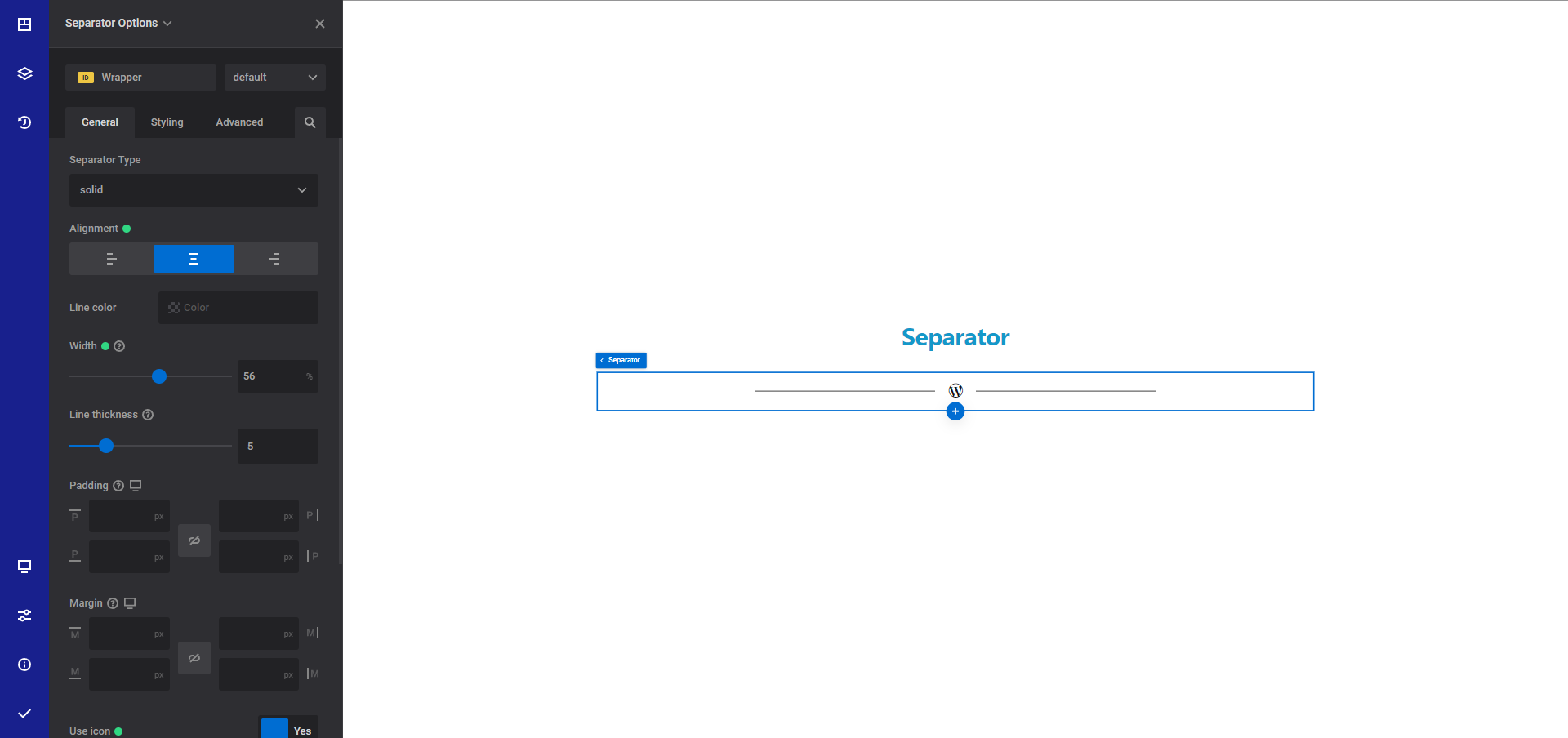
The separator element is a visual design component used to create a clear visual break or divide between different sections or content on a page.
General options
- Separator type - Choose the separator display type. You can choose between solid, double, dashed or dotted separator
- Alignment - Choose the desired horizontal alignment inside the parent container. Please note that for this to work, you will need to set the separator width lower than 100%
- Line color - Choose the desired separator color
- Width - Set the desired separator width
- Line thickness - Set the desired separator thickness
- Padding responsive option - Set the desired CSS padding around the separator
- Margin responsive option - Set the desired CSS margin around the separator
- Use icon - Select yes if you want to display an icon in the center of the separator
- Icon color - Choose the desired icon color
- Icon size - Set the desired icon size
Style options
TIP
Zion Builder elements allows you to style almost every part of an element. All style options follow the same options structure. You can find more info about style options here
- Wrapper - Will style the wrapper of the element.
- Icon styles - Will apply the styles to the icon
Advanced options
TIP
All the options inside the advanced options tab are the same for all elements. You can find more info about advanced options here