 Zion Builder
Modal
General info
The modal element allows you to show your content inside pop-ups that appear based on multiple conditions.
General options
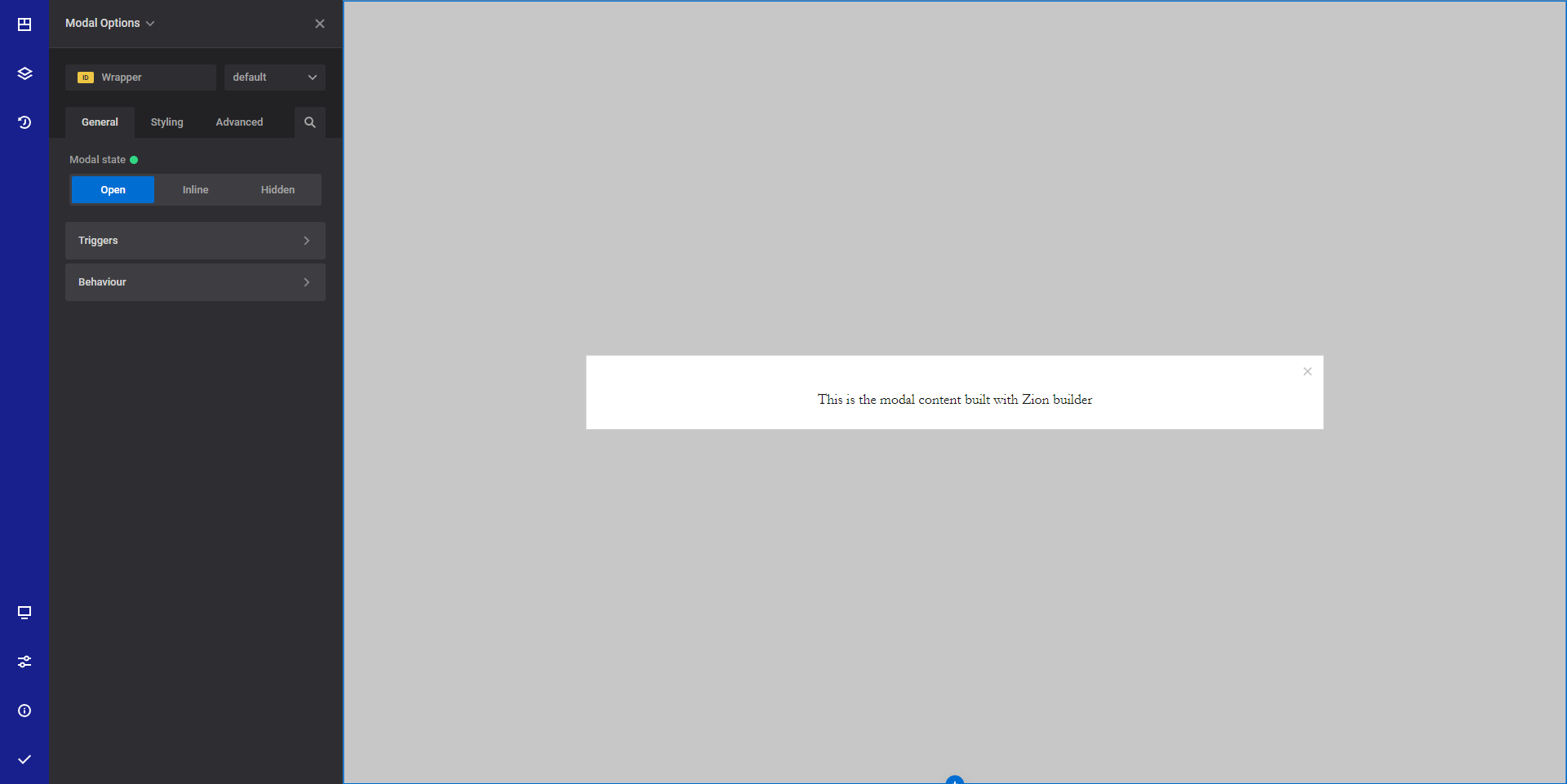
- Modal state - Choose the desired modal stat inside the editor. This option allows you to see how the modal will look like when it is open.
- Triggers - Configure the desired triggers that will open the modal
- Page load - Will show the modal on page load
- Scroll - Will show the modal based on user scroll
- Exist intent - Will show the modal when the user tries to leave the page
- Page clicks - Will show the modal based on user clicks on the page
- Element click - Will show the modal when a specific element is clicked
- Behavior - Configure modal behavior in certain conditions
- Close on backdrop click - Choose if you want to hide the modal when the user clicks on the backdrop
Style options
TIP
Zion Builder elements allows you to style almost every part of an element. All style options follow the same options structure. You can find more info about style options here
- Wrapper - Will style the wrapper of the element.
- Modal content styles - Will style the actual modal content wrapper
- Modal close button - Will style the modal close button
Advanced options
TIP
All the options inside the advanced options tab are the same for all elements. You can find more info about advanced options here